
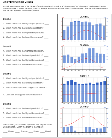
A climate graph is a visual representation of the average temperature and precipitation of a particular location over a period of time, usually a year. It displays the temperature and precipitation statistics for a specific location in a graphical format. This makes it easy to understand and compare the climate of different regions
Students must learn to navigate data and charts in a science class. In fact, many advanced labs in the biology class are about data collection and analysis. With so many sensors in the world collecting data, your students can find data on just about anything. Interpreting data and graphs is an important skill for anyone, not just scientists.
One of my favorite types of graphs is the climatograph, or climate graph. Students must look at three separate variables: time, precipitation, and temperature. Temperature is displayed as a line, and rainfall as a bar graph. Data compares averages for each month over a set time period (usually years).
In this exercise, students examine climate graphs taken from weather stations across the world. I focus on 4 regions in the United States: Alaska, Arizona, Illinois, and Hawaii. Each region has a very different climate. After analyzing the graphs, students answer simple questions, like which month has the highest temperature.
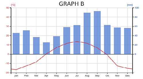
The graphs are not labeled by region. Instead, the last task is for students to match the graphs to the region: Alaska, Arizona, Illinois, and Hawaii.
On the next page, students view data from a weather station in Berlin, Germany. They must then create a graph similar to the ones they just viewed. For fun, you can direct students to climatecharts.net to explore climate graphs from just about anywhere on Earth.
This activity is similar to another data activity on Exploring Biomes. You can assign that one for additional practice with climate graphs and a broader look at biomes in general.