Students practice analyzing data from graphs in this exercise. Ideally, students will have already learned about the various biomes found on earth. A biome is a large community of plants and animals adapted to a specific environment characterized by its climate, vegetation, soil, and wildlife. Biomes are classified based on their specific characteristics, such as the climate, vegetation, soil, and wildlife
Since the main features of biomes are dependent on the temperature and rainfall of the area, this is also a good time to talk about climate and seasons. Some biology curriculums place the ecology unit at the end of the course, and some at the beginning. The Miller and Levine Bee book has the ecology unit at the beginning, chapters 3 – 7
Some books start with a more top-down sequence. Those begin with the biosphere and climate and end with populations. Other books reverse the order.
Exploring Biomes with Graphs
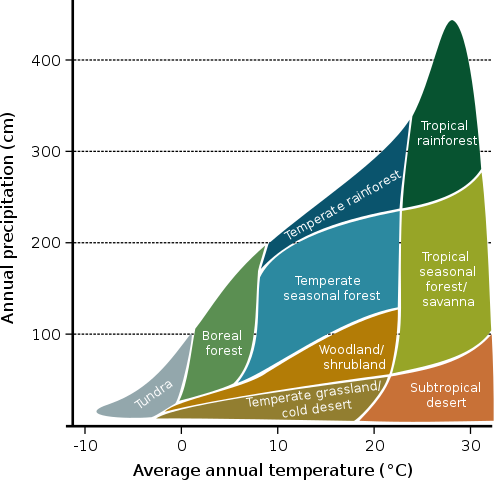
In the first graph, the display shows nine major biomes organized by average temperature and precipitation. They can then compare which biomes have similar temperatures (grassland, shrubland, forest) and which have similar precipitation. The graph shows which areas tend to have the highest temperatures and which have the lowest. It also shows where precipitation is the highest, like in the tropical rainforest.
Next, they examine an unlabeled bar graph and determine which bar goes with which biome. This is mainly accomplished by comparing precipitation levels for each, though some students may have difficulty with this section. You may want to model how to answer that for your students.
In the second section, students examine three climographs from NASA observatory. A climograph shows rainfall and temperature over an entire year. Unlike the previous graph, the climographs show monthly data, not averages. The graphs show data for Alaska, Tennessee, and Arizona. By examining the data, students determine the biomes for each location.
The document is viewable in Google docs and students can type answers directly into the document or you can print the pages for classroom use.