
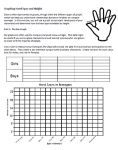
This exercise illustrates the difference between bar graphs and scatter plots and walks students through the process of representing data they collect. In part one, students simple measure the spans of their hands and create a bar chart that compares the number of individuals for a set value, like 155 to 165 mm.
All measurements are made using the metric system (always good to remind students of that when they start). Students draw separate bars for males and females and will likely see a pattern or even a normal curve showing average hand sizes for males and females.
In part two, students create a scatter plot that shows the relationship between the size of the hand and the height of the individual (measured in centimeters). The scatter plot will likely show a positive correlation between hand size and height.
In the final analysis, students consider what type of data sets are best displayed as bar charts and what types would best be displayed as a scatter plot. They must then make a choice about which type to use to show a data set on fish and pond temperature.
Either representation is valid, a bar chart would show average size of fish in each pond and a scatter plot would show that as the temperature increased, so does the overall size of the fish.
The true purpose of the question is to get students to think about how to represent data and realize that there are multiple ways to do so.
To gather class data, I usually write the chart on a whiteboard and have students put their data on the board. Alternately, they can use post-it notes to place on a wall or other surface.
Grade Level: 8-10
Time Required: 30-40 minutes