Here’s a fun activity to do with students to illustrate survivorship curves. You can go outside with students or just use an open area like a hallway. Bubble solutions are cheap and can be bought at Amazon or discount stores.
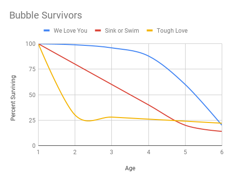
I usually give one container to groups of 2-3. That means one person will be blowing bubbles, another will be the timer and a third can record data. The bubbles represent different groups of animals and their survivorship. Type I animals tend to have long life spans and parental care. Type II animals have a constant (even) loss of members throughout their lifespan. Finally, type III animals will reproduce large numbers, but few survive to adulthood.
How It Works
There are three types of “babies” that students model with a bubble solution. The first type is a bubble that receives a kind of parental care. Once the bubbles are blown, members of the group can help the bubble survive by waving their hands to keep it in the air. Ideally, this bubble will survive longer than bubbles that receive no help, which is the second set of data. A third type of bubble is the “tough love” group. This bubble must pass through a metal ring (made with a hanger or frame). If the bubbles don’t pass through the ring, or hit the ring, they represent individuals who die in infancy. Those that pass the initial test will be timed until their deaths.
Once data is collected for the three groups, students use a Google sheets to create a graph showing the three survivorship curves. I use this activity to give students a basic lesson on how to construct a graph using a spreadsheet. I’m always surprised that many students have never had to use a spreadsheet. Their bubble graph will look similar to survivorship curves they’ve seen in texts.