How to Use a Spreadsheet to Create a Graph
In this exercise, you will examine food labels to determine the weight of the produce in ounces and in grams. Then, you will input this data into google sheets to create a line graph.
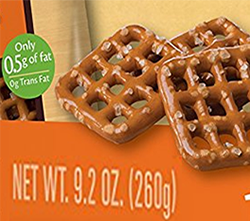
Food labels may be available from your teacher, or you may receive a printout with sample items to include in your data set. These food labels will have an English unit (ounces or pounds) and a metric unit (grams or kilograms.)
Make sure all units are in ounces and grams, you may need to convert in some cases. (Hint: Google can help you make conversions.)
Input Data into Google Sheets
1) Open Google Sheets (You may need to log in)
2) Click "Start a new spreadsheet (blank)"
3)
In row 1, column A (1), type the word "item" this data will match your item labels
4) In 1B, type the word "ounces."
5) In 1C, type the word "grams."
6) Input the data you collected on your labels.
7) Organize the data from smallest mass to largest. Do this by using your mouse to highlight all the columns, right click an choose “sort range.” Sort by Column B then choose A → Z
8) Your next task is to create a chart with your data. Highlight our data set (including the headers: ounces and grams) At this point , you do not need the item information, and then click on the chart icon in the top bar.
9) The default chart will be a "column" chart. This is not very useful for our data set. We want a chart that shows the ounces on the X axis and the grams on the Y axis. Under the "data" tab is a menu to choose a different kind of chart. There are many options.
10) Click on Line chart, and then choose "Use column B as labels"
11) Now you have a straight diagonal line, but you're missing the labels on the X and Y axis. Click on the tab that says "customize" and go to the "chart and axis titles" menu.
12) Give your chart a title. Call it "Ounces to Grams"
13) Under Horizontal axis title type "Ounces" in the title text area.
14) Under Vertical axis title, type "Grams"
15) Next, go to "series" and change the color of your line to black. We only have lack and white printers here.
16) In the same menu, change the point size to 2px, this will make the line smoother.
17) Your chart has a legend, that is not necessary for this type of graph, find the legend settings, and switch it to "none" which is under position.
18) Finally, the gridlines are much too large. Switch the gridline count to "5" for both the major and minor gridline count.
19) Place your graph below your data table. Make sure it has all the appropriate labels and title. Place your name in an empty grid above the graph. Print your document and turn it in or share it with your instructor.
Congratulations! You now know how to create a basic graph using google sheets!