Analyzing Data
Google Doc
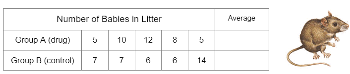
1. Mouse Experiment
An experiment studies the effects of an experimental drug on the number of offspring a mother mouse has. 10 female mice are given the drug. The number of mice in their litters is compared to the litters of mice that did not take the drug.
2. Cow Growth Rates
A type of feed claims to boost the growth rate of cows. The feed is tested on two twin newborn cows. Bessie receives the experimental feed, and Bertha receives regular corn feed. Their weights are recorded below.
| Month | April | May | June | July | Aug |
Bessie |
100 lbs | 210 lbs | 260 lbs | 320 lbs | 400 lbs |
| Bertha | 100 lbs | 250 lbs | 290 lbs | 340 lbs | 400 lbs |
Graph the data; use a dotted line for Bessie and a straight line for Bertha. Make sure you label the X and Y axis.

Both cows ended at the same weight, but did the experimental feed change the way they gained weight at all? Describe your conclusions about the experimental feed and explain why it is important that the experiment used twin cows?
3. Town Populations
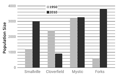
a. According to the graph, which town grew the fastest?
b. Which town declined in population?
c. Which town had the smallest change in population?
d. What is the population of Forks
in 2010?
4. Insect Graph
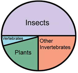

a. According to the graph, which group of organisms has the most number of species?
b. What is the total percentage for all invertebrates? What about vertebrates?
5. Food Sales (Scatterplot)
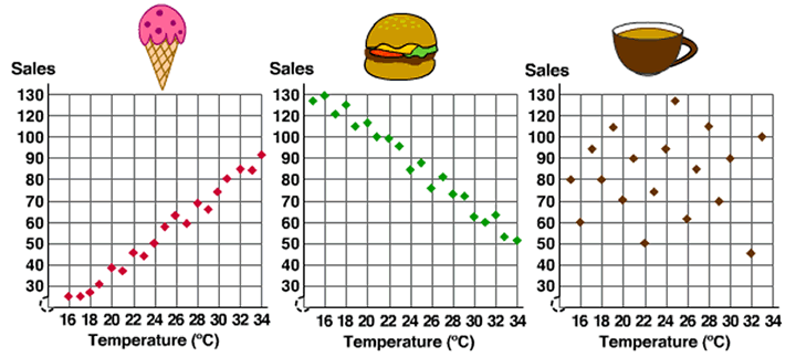
a. A positive correlation occurs when one set of values increases, so does the other set of values. Which food shows a positive correlation between sales and temperature?
b. Which shows no correlation?
c. How could a park manager use this type of information?
6. Tiger Sharp Population
The population of tiger sharks off the coast of Florida was recorded over several months. Graph the tiger shark populations below.
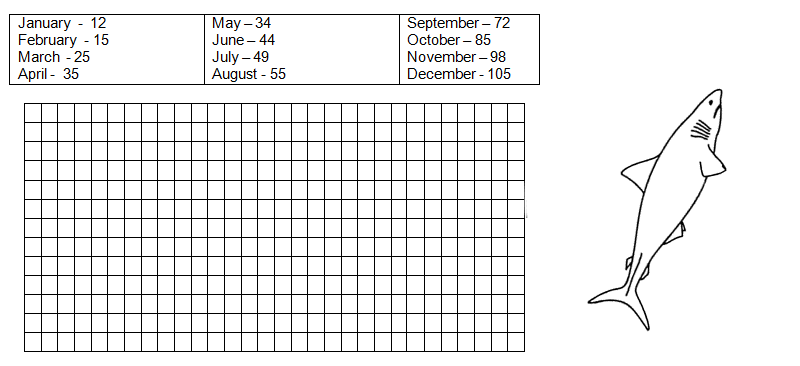
The number of nurse sharks was also
recorded for this time period; though the person recorded the number was not
as reliable as the person recording tiger shark numbers. The following data
was taken on nurse sharks. Use a different color to graph the nurse shark population
on the graph above.
March - 60 | April - 52 | July - 38 | August - 20 | November- 14 | December - 11
a. At what month would you expect the number of nurse sharks to equal the number
of tiger sharks?
b. What does the graph tell you about the trends both shark populations?
7. Time Spent Studying
| Tim | J.R. | Sue | Pat | Jay | Red | Ben | Sam | Cat | Lex | Vic | Drew | Fin | |
| Time Spent Studying (min) | 30 | 5 | 60 | 30 | 5 | 20 | 40 | 10 | 15 | 25 | 10 | 70 | 20 |
| Grade on Test (%) | 70 | 50 | 90 | 80 | 60 | 70 | 90 | 60 | 70 | 80 | 50 | 100 | 80 |

Graph the "time spent studying" on the X axis and the grade on the Y axis. When you have plotted your points, draw a LINE OF BEST FIT.
Summarize your graph in a single sentence.


 This work is licensed under a Creative Commons Attribution-NonCommercial-ShareAlike 4.0 International License.