
Students will likely forget a good portion of all the details they learn in class, but there are certain skills that will stay with them for the long term. I spend a lot of class time working with charts and graphs, helping students understand why images of data (graphs) can be very powerful. They learn to identify things that are not supported by the data or things that really can’t be determined from the information given.
This falls under objectives within the common core, next generation science standards and within the AP Biology Science practices:
(AP Biology) Science Practice 5: The student can perform data analysis and evaluation of evidence.
(NGSS) Science and Engineering Practices: 4. Analyzing and interpreting data
CCSS.ELA-LITERACY.RST.9-10.7 : Translate quantitative or technical information expressed in words in a text into visual form (e.g., a table or chart) and translate information expressed visually or mathematically (e.g., in an equation) into words
Many students don’t find graphs all that exciting and they are overlooked in textbooks. To make graphs more engaging, I treat them as mini-mysteries. If you are shown a graph with limited information, how much can you really learn from it?
Student Activities Using Graphs
I give students graphs with no explanation and we work together to summarize and explain. These are displayed on the overhead projector when students walk in, and sometimes serve to “hook” kids into the topic of the day.
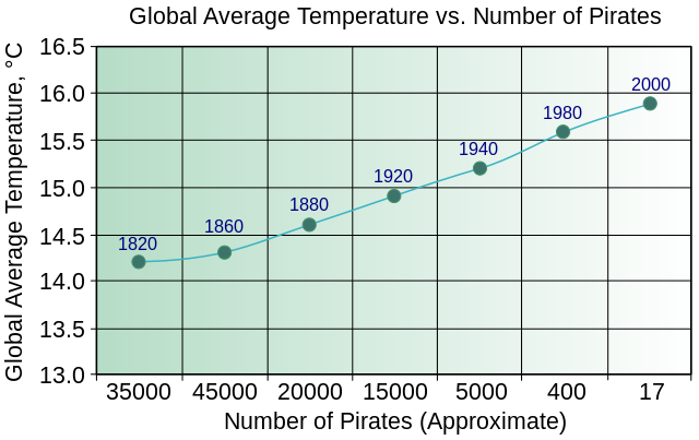
Some graphs are just funny or interesting and promote discussion or dialogue. This one on global temperature and pirates is a good introduction to the idea that correlation does not equal causation. (For more information on correlation/causation, check out fromquarkstoquasars.com/correlation-vs-causation/ )
Turn Graphs into Mysteries
You don’t always need to give students the full article if a chart or a graph can be used to summarize the research. For example, if this graph was on the board, you could ask students a series of questions and discuss, as a class, the advantages of a graphical display and its limitations.
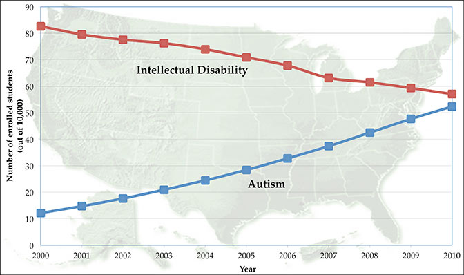
A cursory glance might reveal that autism rates are increasing, but there are many other discussion questions that can look deeper at this one chart.
1. Why would autism rates be increasing?
2. Have you heard anything in the media about what may be the cause of autism?
3. What is intellectual disability? What is the trend for this diagnosis?
4. How are the two lines related? (Or are they?)
5. What questions do you have about this data?
The full story this graph can be read at Sciencemag.org.
By the end of the year, most of my students are skilled at reading graphs. They also create graphs using spreadsheets, though I’ve noticed that creating graphs doesn’t seem to be as mentally engaging as evaluating graphs (technology makes it too easy). Throughout the year, they see graphs as part of lectures and an integral part of solving case studies like Case Study: Cystic Fibrosis. By the end of the year, they’ve learned not to glance at graphs, but to really look at them, sometimes even before you read the text.